Overview:
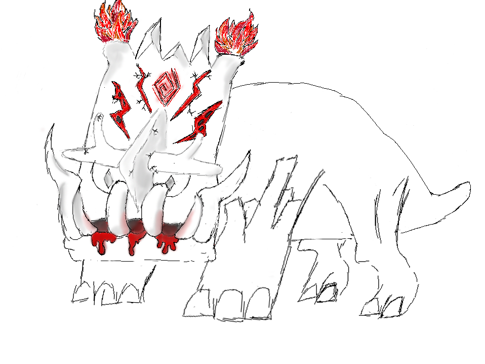
As an introduction to the Art and Animation Fundamentals module, our first task was to create a character or environment concept using Adobe Photoshop. I decided to draw a boss from a game idea that I have been meaning to draw for a while.
Inspiration:
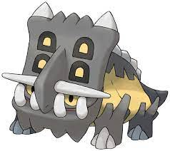
I took my main inspiration of the shape and build of the creature from triceratopses and the pokemon, Bastiodon, specifically using these images as references.
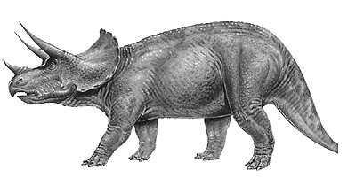
In my game, this boss is supposed to act bullish, charging forwards into walls after the character, so I decided that the bulky head crest of Bastiodon fit what I was after very nicely. However, Bastiodon doesnt have a very obvious body shape so I used the triceratops.
With the legs I decided to have the front 2 be like more armoured, grown versions of Bastiodon’s legs, making it more able to smash into things as it charges without damaging itself, however, the hind legs I decided to just take the more plain triceratops legs as if those legs are unlikely to be hitting things, they can focus on the muscle and working well as legs letting it get up to the speeds it needs to start ramming, rather than having all 4 limbs be armoured which could quite easily limit manoeuvrability but that might be wrong if a biologist wishes to correct.
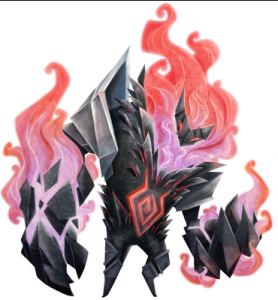
In terms of style for the boss, I really liked the combination of fire and metal shown by the character, Hatred, from the board game Cerebria. This colour scheme and theming seemed to suit the style of the boss as it itself was based on rage. Upon redrafts, I would integrate more aspects of this style, leaning more into the metal and fire combination as seen on the forearms.
Improvements:
I tried my best to add the jagged metal spikes and fire onto the boss’ crest but i think my limited knowledge and practice on Photoshop and drawing in general limited it slightly. I also feel that the body/back is rather empty so on another draft I think I would try to add more of the jagged metal like that seen on Hatred’s more prominent shoulder as armour. I would also add more consistent shading and colouring as I tried to keep the light source consistent and adding shadows accordingly but it has ended up quite sporadic, only having shadows and colour on the crest, which would be top of the list to be sorted on a second draft once I have had more practice blending colours and messing with perspective to get the best shadows.
Overall:
I think there are certainly parts of the draft that are lacking, such as the lack of colouring and shading, and the plain/empty back. However, as a first draft type of thing, I am happily surprised with how it turned out. I tried new techniques such as layers and the colour blending tool to try and create a glowy effect coming from the mouth to try and give the sense of it dripping lava, which admittedly looks like not glowing blood. I am also happy with the overall proportioning, using the lasso tool to use combinations of warping, rotating and transforming to try and find the sizes and angles that i thought fit the character.
Basically its far from fantastic and there are plenty of improvements to be made in subsequent drafts but I am happy with it as a first draft and exploration of Photoshop’s mechanics.